| | To the left, the gallery of images reflects the basic construction and formation of the page.
|
|
0 Comments
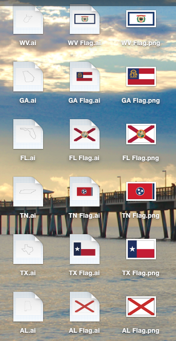
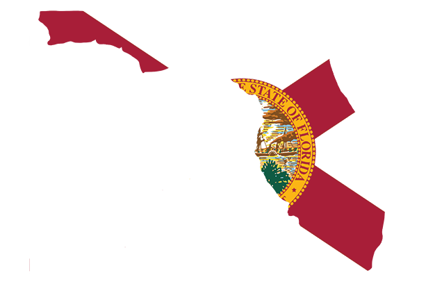
On the initial design that I made, I included the outlines of the state where each artist or band was from. But as I was creating the spread, I noticed that a black outline with a white fill of each state looked rather boring. To fix this, I was going to insert pictures that I've taken while I've been in each state. While this sounded like a good idea at first, I noticed that I'd have to keep all of the fill images similar in size, color, tone and theme, which turned out to be very hard to do. Because of my confusion, I turned to my fellow group members as well as our design teacher to ask for their opinions. They all recommended filling the outlines of the state with the sate flags. I turned back to Adobe Illustrator to recreate each state flag with my own touch to it. The screenshots are shown below.
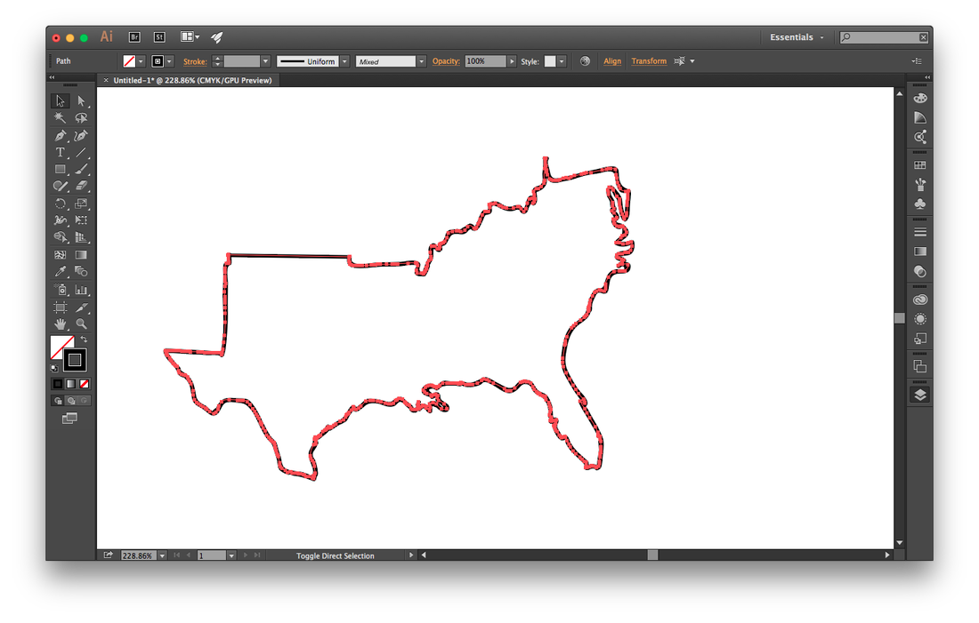
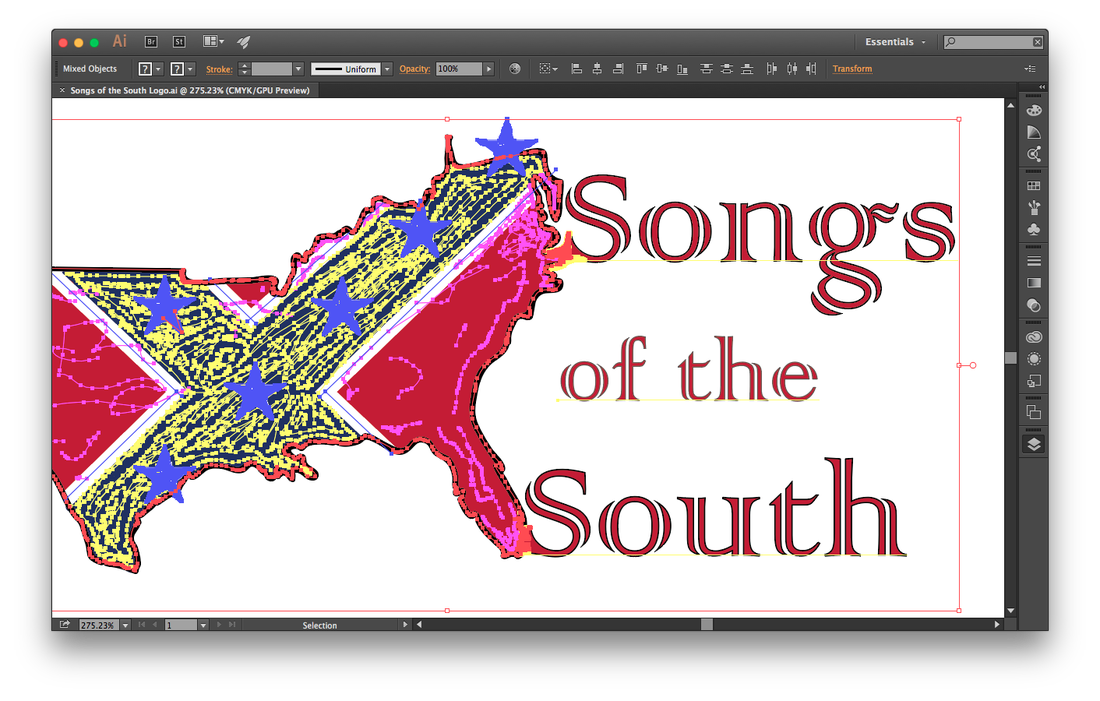
Gallery of States With Flag Fills Ironically, one of t he hardest parts of the project was just creating the title for the actual spread page. I had very specific intentions when creating it. It wanted it to say "Songs of the South", with a fill color of red. I also wanted each tail of "S" letter for "Song" and "South" to connect back to an outline of the southern United States. Because that design idea isn't a specific font and I had to use my own content, I stepped away from Adobe InDesign and looked towards Adobe Illustrator. The gallery of the images and bitmap that I used to create my title is shown below in screenshots. Hover your mouse over each image to reveal a caption.  |